For help with all things Communico, visit the Communico College page for walkthrough videos, instructions, etc.
Peach Days slides for basement screens: https://docs.google.com/presentation/d/164qx9KtA2bdI9CdulO6ZKs3qieCQKFyWlKI1dzVa-a0/edit?usp=sharing
Niche Academy Link: https://my.nicheacademy.com/utah-libraries/course/42811
- Use empty container blocks with modified "spacing" to create buffers when needed, but use sparingly and check with different screen sizes. You can also put borders on edges of any block type to create dividing lines. Put blocks inside container blocks and change interior block's background color and border radius to round edges and simulate bubbles (radius of 7-10 makes nice rounding).
Colors
LOGO YELLOW (222, 172, 11) #deac0b
LOGO BLUE (36, 71, 93) #24475d
LIGHT GREY (240, 240, 240) #F0F0F0
DARK GREY (118, 113, 113) #767171
Attend Preschool #FFC000
Attend Children #ED7D31
Attend Teen #70AD47
Attend Adult #4472C4
Attend Family #954F72
Attend General #24475d
Event Link Patterns
Base link: https://library.bcutah.gov/events or https://bcpl.libnet.info/events
Specific date range: ?start=22-06-01&end=2022-06-30
Show more days than present from date clicked: ?r=days&n=7
Specific keywords: ?term=story+time
Specific event type: ?t=story+time
Specific ages: ?a=teens
Calendar view: ?v=grid (default view is "list")
Compound example: ?term=story+time&r=days&n=7&a=childrens,preschool
If you’re using more than one filter in a particular group (e.g. multiple age groups) place a comma between your words. If you’d like to use multiple types of filters simply place an ampersand in between your filters. You can also use location (l) but since we only have one branch this isn't as useful.
More filter tips and codes at https://communicocollege.com/attend-urls-1141
Registration Links
If you want to link directly to a registration form instead of an event description, add ?registration=true to the end of your event url. You can also find/create these links by following a Communico-generated registration QR code in the "marketing" section of each event. (e.g. https://www.brighamlibrary.org/event/12345678?registration=true)
Heading 1
- Page title
- Top of page, left aligned
- Title Case Capitalization
- Keep short
- Don't use more than one H1 (it confuses search engines)
Heading 2
- Main topics
- Use similar keywords to H1
- Think of as "chapters" of the page
- Title Case
- Keep short
Heading 3
- Secondary Topics/Subcategories to further break up topics
- Use in long H2 blocks
- Make info scannable
Heading 4
- Small sections or sidebars
- Info boxes, etc.
Heading 5
- Infrequent
- Note, this is ALL CAPS
Heading 6
- Infrequent
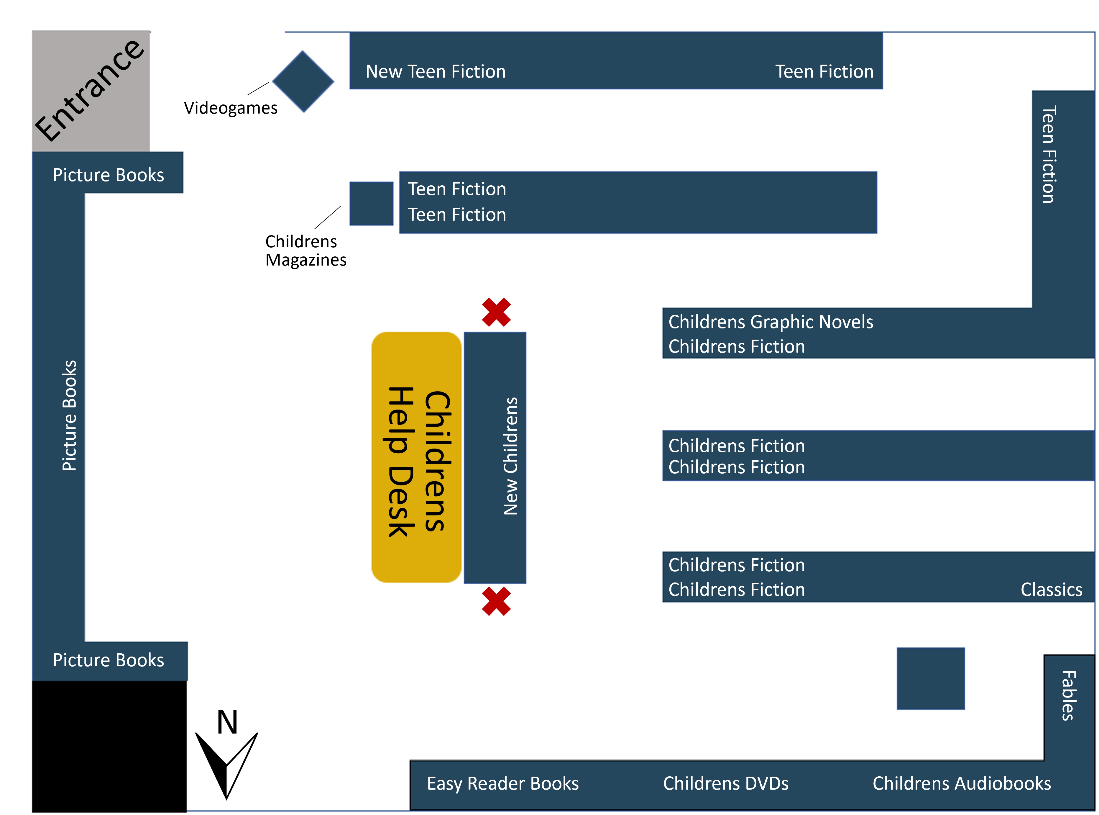
Children's Area

Amenities
- Help desk
- Childrens play area
- Catalog search computers
Collections
- Picture books
- Easy-reader books
- Childrens chapter books
- Childrens graphic novels
- Fairytales
- Childrens DVDs
- Childrens Audiobooks
- New childrens books
- Childrens magazines
- Videogames
- Teen books
- New teen books
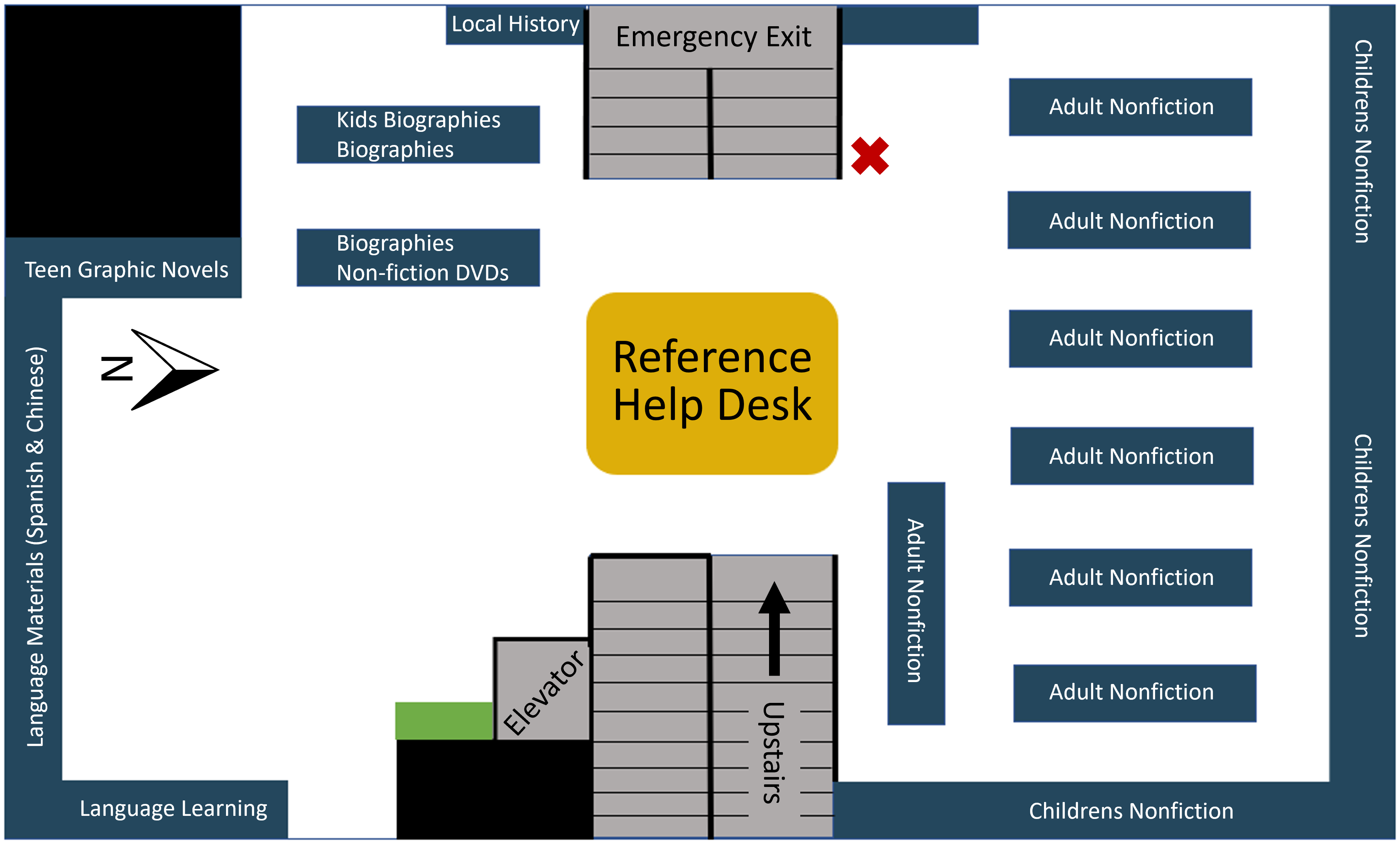
Top Floor

Amenities
- Help desk
- Quiet study area
- Catalog search computer
- Document scanner
- Microform machine
Collections
- Nonfiction (adult & children)
- Teen graphic novels
- Biography (adult & children)
- Nonfiction DVDs (adult & children)
- Non-English materials (Spanish & Chinese)
- Local history
- Reference
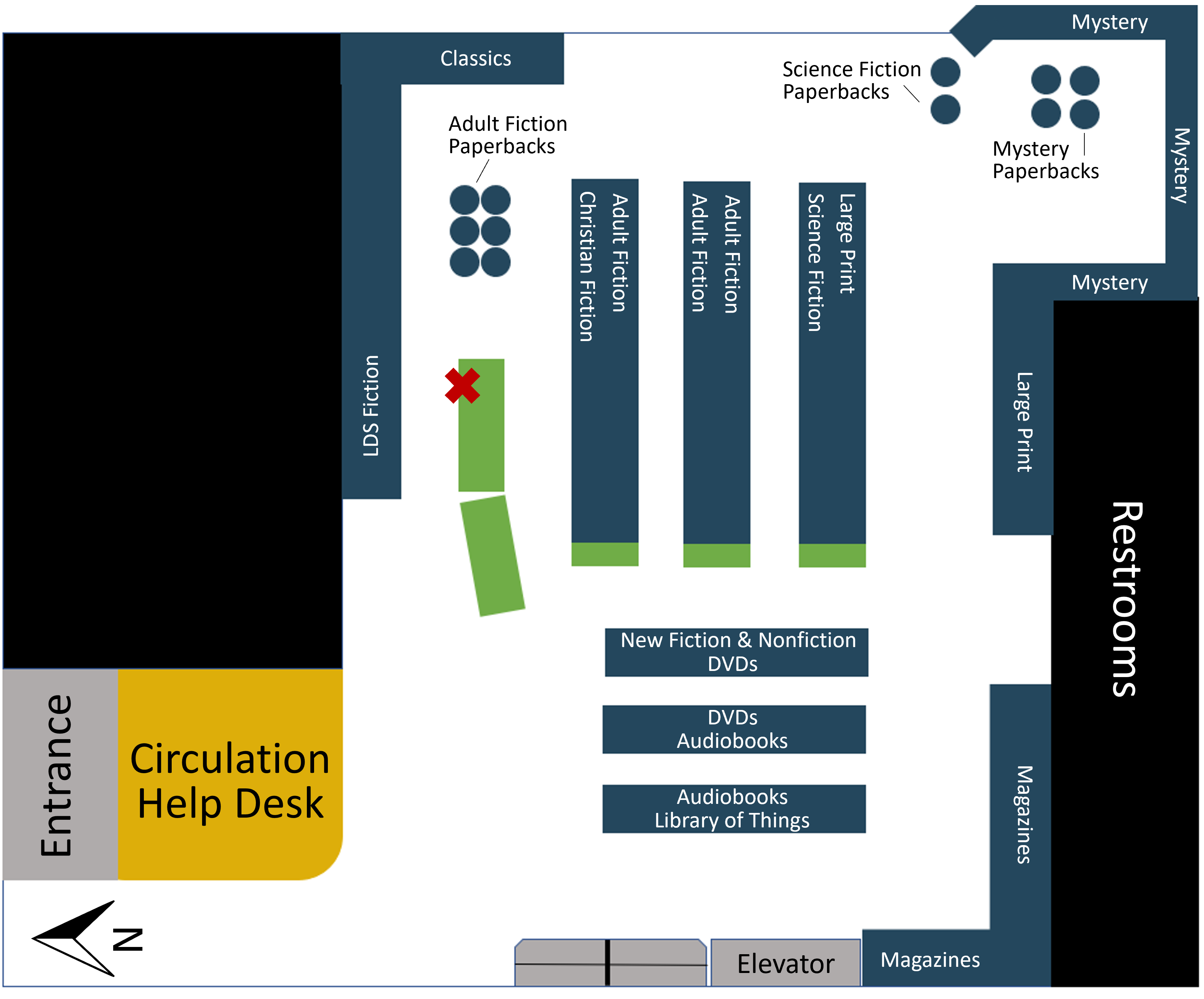
Main Floor

Amenities
- Help desk
- Public computer stations
- Catalog search computer
- Study areas
- Restrooms
- Printer & copier
Collections
- Fiction
- Science fiction
- Mystery
- Large print
- LDS
- Christian fiction
- Paperbacks
- New books
- Audiobooks
- DVDs
- Library of Things
- Magazines
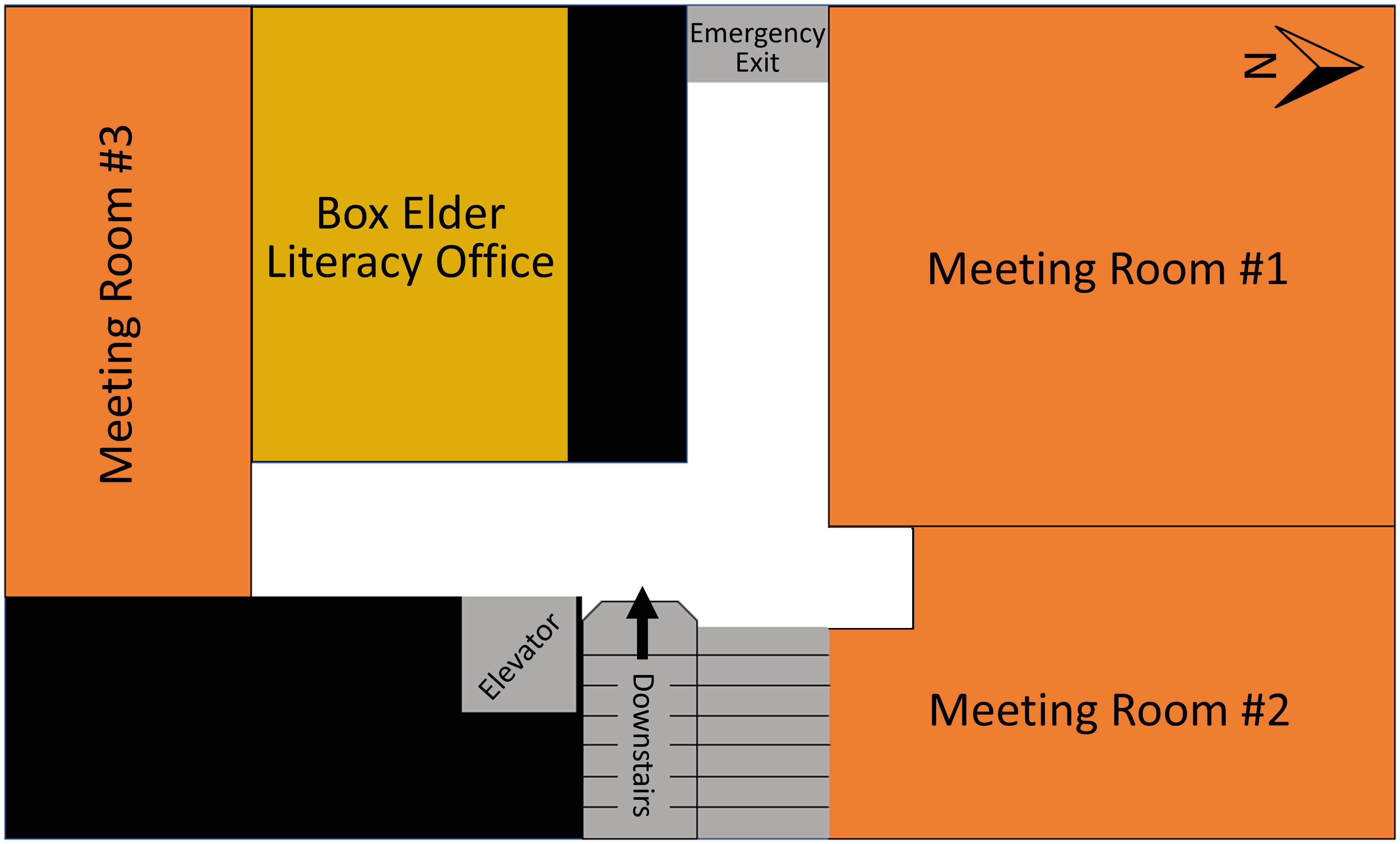
Basement

Amenities
- Study rooms
- Literacy office
Block Management
- Use containers to manage scrolling order.
- Side bars 3 or 4 width snaps from right side.
- Check that order & spacing look good in mobile format.
- Duplicate blocks and change visibility settings to adjust layout for different screen sizes.
QuickLinks Box
- Common link-outs
- Use "Custom Style 2" on content block settings (adds border and grey background)
"Custom Style 3" makes the block or container background grey with square corners. Good for alternating row visibility.
(Change or add Custom Styles in Custom CSS)
"Custom Style 4" makes the block or container background grey with rounded corners. Good for blurb bubbles.
Set content blocks inside container blocks with modified spacing to keep bubbles from bleeding into each other.
(Change or add Custom Styles in Custom CSS)
Buttons
- Use this order: Anchor, span, strong (if needed), text.
- Add a style with "none" text decoration to the anchor tag.
Images

- Images in their own block when possible.
- DO NOT USE THE CAPTIONS FEATURE. Makes it impossible to delete/edit. Just add captions in the same block, or a seperate block below.
Pulling Images From External Sources Using HTML
To avoid downloading tons of book cover images to our website's media folder, you can pull images from our Enterprise catalog using HTML code instead. The book doesn't have to be in our library's catalog for this link pattern to work. For examples of this linking in action, view the code on the "P/K Past Titles" page.
URL Link Instructions for Enterprise
- Copy and paste the green HTML snippet into your page.
- Copy and paste one of the syndetics URLs into the bolded portion of the green code. (In my experience, the jpg URL is usually higher quality than the gif.)
- Replace the red #s with the book's 13-digit ISBN number. (You can test links by adding the ISBN and dropping the link into a web browser first)
URL Link Patterns/Pieces for Enterprise
- <img src="https://www.URL GOES HERE.jpg" alt="cover art">
- https://secure.syndetics.com/index.aspx?type=xw12&client=brigcl&upc=&oclc=&isbn=#############&issn=/LC.JPG
- https://secure.syndetics.com/index.aspx?type=xw12&client=brigcl&upc=&oclc=&isbn=#############&issn=/MC.GIF
